.png%3Ftoken%3DeyJraWQiOiJzdG9yYWdlLXVybC1zaWduaW5nLWtleV9jZWQwMGE3Zi02MThhLTRlMWQtYWQ5My05MDYxMmI5N2M5MTAiLCJhbGciOiJIUzI1NiJ9.eyJ1cmwiOiJibG9nLWltYWdlcy83IHV4IHBhdHRlcm5zL2ltZy1hcnRpY2xlLTExICgxKS5wbmciLCJpYXQiOjE3NzI0MzQyNTUsImV4cCI6NDkyNjAzNDI1NX0.hhd83RIAyOK02x_4qxVczCH4NK76UcpVJy2Yu24AMfE&w=3840&q=75)
Purpose of this article
I believe some literature on ambient AI agents is lacking. There is a lot of business and engineering content, but little product design literature. This article gathers existing resources (and expands on them) to help designers create better ambient AI agents.
Reading the sources below, and going over my past AI projects led me to identify 7 UX design patterns that maximize product quality and human oversight. For each pattern, we look into user goals and problems, theoretical design solutions, and existing patterns.
Here are the main sources I looked at for this article:
- Paper: The Evolving Role of Human-in-the-Loop Evaluations in Advanced AI Systems
- HBR: Collaborative Intelligence: Humans and AI Are Joining Forces
- LangChain Blog: Introducing ambient agents
- LangChain Blog: UX for Agents, Part 2: Ambient
- Sequoia Capital: What's next for AI agents ft. LangChain's Harrison Chase
- LangChain: Open Source Agent Inbox for LangGraph
- IBM: What is Human in the loop
- Moveworks: What Is an Ambient Agent? The Future of Enterprise AI
- Shapeof.ai: Exploring how User Experience will evolve with AI
- Beanmachine.dev: Thinking of AI Agents as Users
- Aubergine: Designing for AI agent
What are Ambient AI agents
Definition
Ambient AI agents run in the background doing jobs on behalf of humans. Their name comes from their ability to listen to ambient noise and only start working only when certain conditions are met. When they get to work, it’s more than a reflex. They look at what happened (their context), reason based on a goal, decide on a course of action, and execute using their tools. They run semi-autonomously meaning they are programmed to get in touch with a human when they are unsure of how to proceed.
A “classic” AI agent’s context is built mostly from user messages, AI answers, and tool responses. An ambient agent’s context consists of mostly outside world data streams pilling up until the trigger condition is met.
Let's illustrate with an example
Imagine an agent’s goal is to maintain the financial health of all department and flag anomalies early. It listens to the company’s financial system feeds. It gets triggered by an unusual spike in monthly expenses in a cost center, say marketing. Once triggered, it reasons by comparing the current situation with historical spending patterns and the current forecasted spend. It has the ability to contact people in the team to ask for context on current expenses. The final output is a spending report sent by email with suggested next steps.
The unique benefits of ambient AI agents
- Scale: Humans need to sleep and can only track a limited number of signals.
- Proactivity: Ambient agents do not need to be asked to get to work.
- Control: Ambient agents keep humans in the loop when necessary.
The 7 UX patterns listed
Patterns for all ambient AI agents
- Overview panel: Informs on the current status and latest activities.
- Oversight flow: How humans resolve tasks that require their attention.
- Activity log: A comprehensive history of the agent’s actions.
- Work reports: A place to see the output of the agent.
Patterns for customizable agents
If your users can customize their ambient AI agent, you’ll need these 3 patterns as well:
- Event stream configuration: A place to set up what the AI agent listens to and define what specific information will “turn them on”.
- Capacity & Logic configuration: Where you define the AI agent’s goal, their tools, their knowledge, and the logic flow.
- Human oversight configuration: A place to determine the conditions when the ambient agent informs or asks humans for work.
UX pattern 1: overview panel
First, let's align on information architecture for this article. We will refer to 3 different information layers as follows: Agents > Missions > Tasks. Agents have missions, missions have tasks. One agent can have multiple missions. Missions can run multiple times. When missions run, tasks are being performed.
Current state
Your ambient agent could be doing anything at any time. So when your user enters the app, their first goal is to understand the current state: idle, running, paused… Alongside this, there should be a way for them to turn things on/off. For status and on/off button design, hardware buttons are always interesting inspirations.

If you make turning the agent on or off easy, don’t forget to prevent human errors. Here, patterns exist and fall into two categories: blocking confirmations patterns (ex: “are you sure you want to turn the agent off?”) and undo patterns.
Recent missions
Once users understand their agent’s state, they want to go one level deeper and learn about the missions. Good inspirations here are project management apps like Monday.com because this section is essentially a UI list with tasks.
Human oversight needs
Recent missions show users things that went well. You will also need the opposite: a section explaining which missions are stopped and waiting for a human to chime in.
This part needs to be very visible on the interface. It there is a job to do, a good inspiration is a todo list app. On the flip side, if there is no work to be done, the empty state will be important to get right as well. It is a desired state, people want to reach the “Inbox Zero”
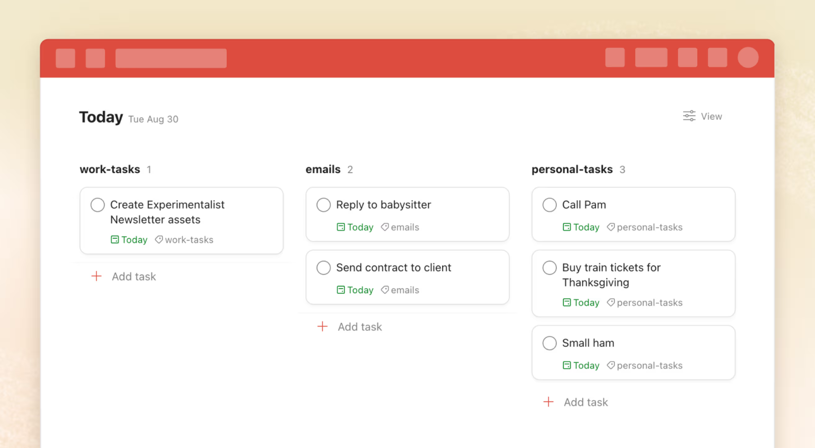
Outputs & costs metrics
Your agent is here to do things for you. Users will want to see some high level KPIs about how much work has been done for you. Here, I think the Tesla car interface is great. They worked really hard to make a small number of KPIs stand out.
UX pattern 2: oversight flows
Here, users are responding to agent requests. They want to be able to step in, get the relevant context, and unblock the agent. To make a good oversight flow, you need:
- A notification system for contacting users.
- A place to show the missions that need human attention.
- A form system to unblock the agent.
Getting a notification
Pick a medium (Slack, Email, Phone…) that fit your users. Be concise: 30-60 char for the subject line and 50-120 for the preview, because research shows that over half of emails are read under 10 seconds.
Be strategic with what triggers a notification, don’t bombard users (this is discussed in depth in pattern 7). For maximum open rate, focus on information such as: the type of action required (need validation, need information...) or the part of the agent flow that needs help.
Landing on the mission page
Once the user opens the notification, they arrive on a landing page (an email, a part of your web app...) A good inspiration for simple UI here are e-commerce emails.
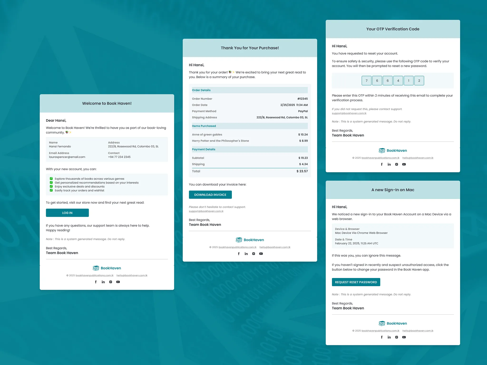
Here, there are two options depending on the level of complexity of the humans task.
1.One-step resolution: If the user action is simple, like a yes/no validation, then you use the landing-page as a way to get the answer. 2.Multi-step resolution: If the user action is complex, the landing page becomes an opportunity to share more about the context, the issue, and what the AI needs. Don’t overshare, this landing is just where they decide if they need to take care of things right now or later.
Regardless, your goal is to maximize the conversion rate of that landing-page. So add a large CTA and some urgency markers.
Chaining HITL tasks
If there are more than one HITL tasks for the user to work on, you may need to show a list of prioritized tasks, or chain tasks one after the other. The folks at LangChain say that a “customer support dashboard” is a great abstraction, other people talk about the mail inbox being another good one.
How you describe each ticket matters: help users recall information from the notification: the criticality, the action required (validation, information…), the part of the agent that needs help. You may also want to convey urgency with a timestamp of how long the agent has been blocked.
Resolution flows
There are 5 types of resolution flows because agents don’t always need the same level help. A situation may call for a simple confirmation, while another requires complex human knowledge.
LangChain identifies three levels of interaction: Notify (let the user know an event happened), Review (let the user validate an action), Question (ask the user for missing information to unblock). I expand these levels to five to reflect more nuanced UX needs by dividing “question” in two and adding a flow for Errors.
1/ Communication: A task went well but its criticality is such that it warrants informing a human. The human has nothing to do. Example: “The agent successfully reconciled all invoices this morning.”
2/ Validation: The agent found a solution but holds off on execution because the risk is too high. Here, an interesting pattern to look at is the Tinder swipe. Intuitive validation, context right dead in the center, and automatic chaining of the next task. I expect this pattern to become more mainstream. As automation moves faster than regulation, many domains will be fully automated but still legally require human sign-off (e.g., medical diagnosis, job offers, or investment decisions).

3/ Decision: The agent understands the situation and sees multiple resolutions. It presents these as options (buttons, cards, drop downs…) and clearly describes the context and implications of each choice. Example: “Should we reallocate this unused budget to marketing or save it for next quarter?”
4/ Context: The agent is missing information it cannot infer from its context. Here, you will need to build informational pages to transfer context to humans, and then lead the user to a form to communicate the missing information. For great forms, read Forms that work. Don’t forget to spend time on the context: the system should display why the information is needed or how it will be used. Example: “The candidate’s legal name is spelled differently, I need the correct spelling to finalize the job offer”.
5/ Error: Sometimes, things simply go wrong: a tool fails or a query times out. Error flows should explain the failure, present recovery options (retry, ignore…), and allow users to take over to do the work. Example: “The Salesforce API returned an authentication error while syncing accounts, please reconcile the records manually”
UX pattern 3: Activity log
Not every mission involved a human, so we need a place to see all the work.
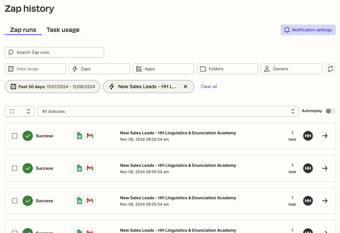
The mission list
On this surface, the user goal is to find a specific mission. The mission being searched is often recent so a reverse-chronological timeline is best. The mission may be about a specific topic, so clearly label triggers, data sources, tools, outcome… The mission may be old, filters and a search box will help. Analyzing a mission may take longer than a session or done somewhere else than on your tool, so let them “save for later” and “download”.
A good illustration is Zapier which provides a history of every automation run, showing each step and data passed.
KPIs
The mission list will get long and KPIs can be a great way to help users understand things at a high level. Users might be wondering: what’s my mission success rate, how often is a human involved, what are my new tasks since the last time I looked at this, how much do I spend on tokens…
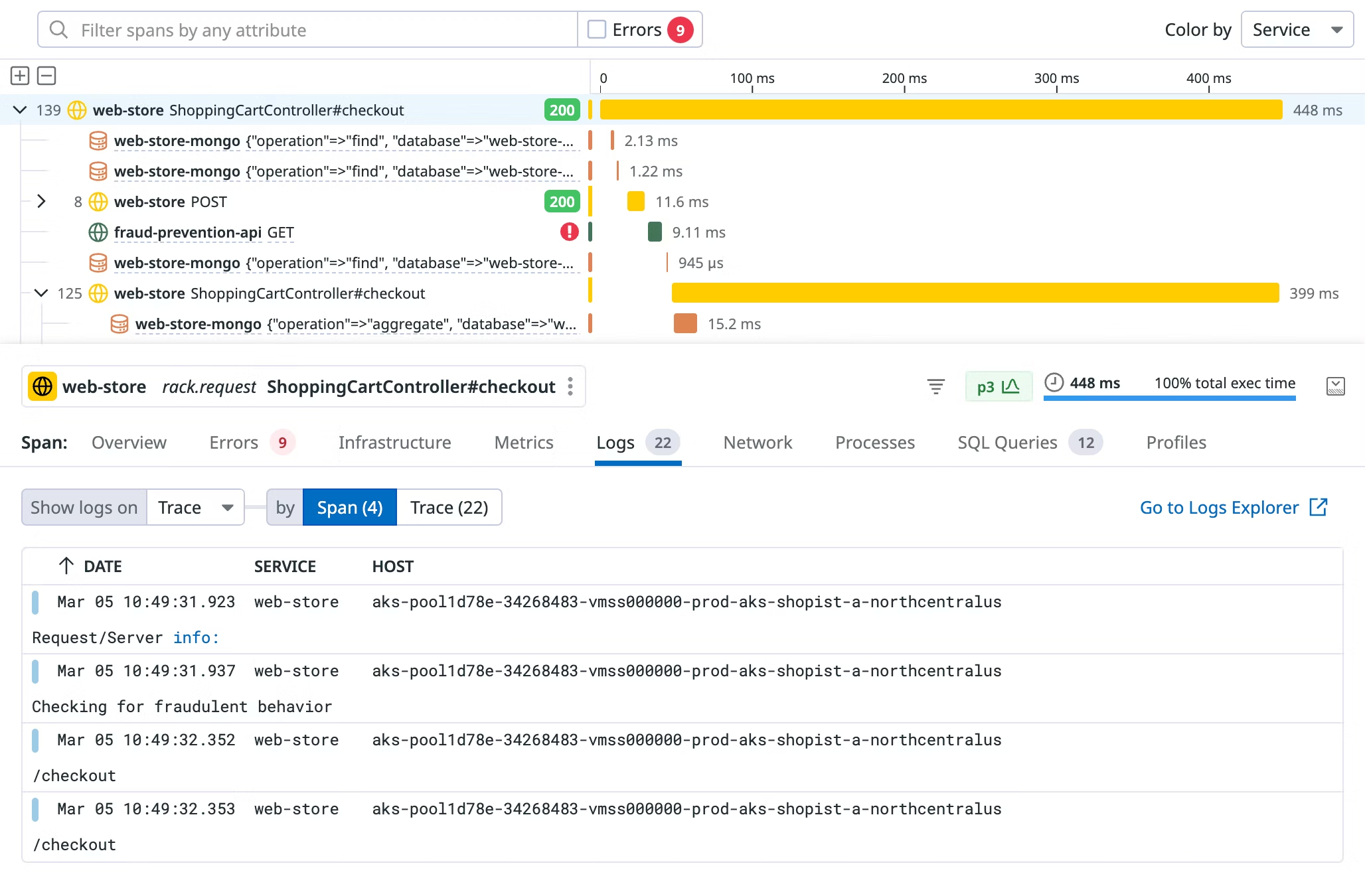
The mission detail page
Once a user found the mission they are looking for, their goal is to study or debug. Users generally debug chronologically. They start either from the first or last task of the mission, then study each task’s input, processing, and output until they find the point of failure. This is a core user need, so make this list prominent. A user could also need high-level info to ease into the work. So you could build a header with some higher-level properties.
- The end result (success, failure, error).
- The task duration and/or spend.
- The number and nature of the tasks.
Coming back to the list of tasks, users should differentiate the types (trigger, reasoning, tool calls, human in the loop…), and understand what data passed between tasks. Here, Datadog traces are a good source of inspiration.
UX pattern 4: Work reports
The next design challenge is to show what the agent actually accomplished.
What type of outputs exist?
Ambient AI agents can do anything, you can’t categorize their work clearly, I see it more as a spectrum: on one side, content outputs, on the other: operations. This framework is a living categorization. Please let me know if you think otherwise.
- Content-heavy outputs are artifacts such as reports, summaries, communications. Example: a budgeting alert agent monitors marketing expenses. When spend crosses 90% of the allocated budget near the end of the month, it investigates and sends a report with recent data and action items.
- Operations-heavy outputs move processes forward. Example: a customer support triage agent classifies a negative ticket, searches similar past incidents, and escalates to the right person. Here, the “output” isn’t a document, it’s the operational change itself.
UX patterns for work reports
There are as many UX patterns as there are types of outputs. It will be specific to your agent’s domain, so look at inspirations in your industry. Here are a couple of ideas that I think hold true for all cases. Content-based work should be sent to the tools people already use: email, Slack, dashboards… Expecting users to log into a separate interface just to read AI-generated updates will hinder your adoption. Content work should also leverage formats people are familiar with.
Operational outputs are less tangible, so a dedicated report may not apply. Maybe the only think you need is to summarize the outcomes through KPIs: total jobs completed, error rates, human handoffs, time saved, or API spend.
UX pattern 5: event stream configuration
This is where users configure the data sources and trigger levels of their ambient agent.
Browse and set up the integrations
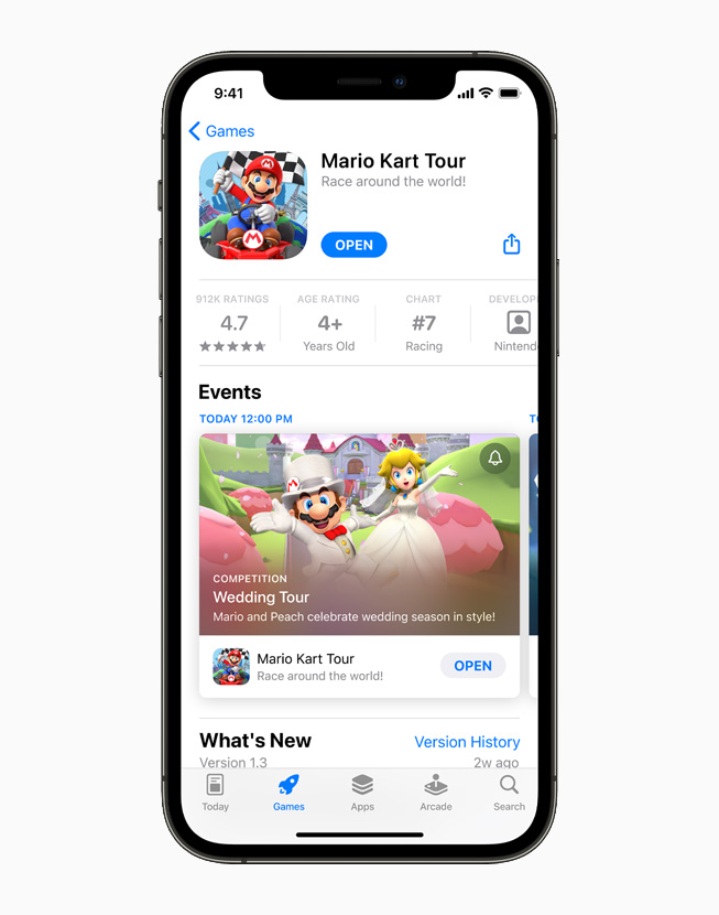
To allow users to browse and integrate sources, the catalog pattern is great. The list of integrations should be categorized according to your users’ needs. If you offer many integrations, consider building category pages, filters, and search. Each integration should have a dedicated page that shows name, category, status indicators (connected, error, disabled…), and a description of what you can do with that integration or what information you can listen to. A great list discovery and catalog experience is the App Store.
Once the user has discovered the data source they want, their next goal is to set it up. This should be fast and low-code. Provide step by step guidance with anonymized examples. If adding code snippets is necessary, provide easy copy-paste. A great inspiration here is the stripe documentation. Finally, once a user has several connected sources, they should be able to see their list somewhere.
Define the trigger and threshold
How users define when an AI agent should act is a complex UX challenge with few existing patterns.
Customizing triggers
Let’s break it down. First design decision: how you enable users to customize triggers. You have three main patterns: natural-language, linear flow, 2D map.
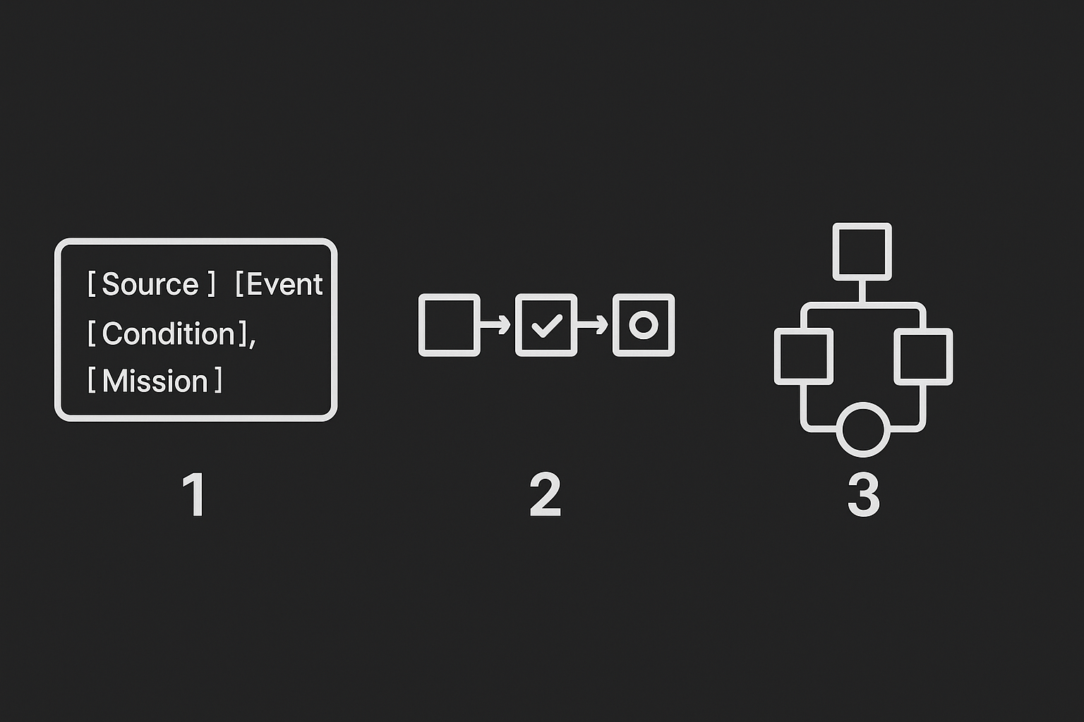
- First, natural-language. Think CustomGPTs, users have a large text box where they can express themselves: “When [Source] emits [Event] where [Condition], then trigger [Mission].” This will be easy for users comprehend and get started. But for a trigger to work, there is a set of information they need to mention, so be aware you will need to design warnings for when users forget to mention mandatory data in the form.
- Second, the linear flow. This is similar to IFTTT: a block lead to the next which leads to the next. A user can start from scratch or a pre-built flow. Each node refers to a different step such as a source being listened to, or a condition, or a resulting mission. These flows are easy to understand because they are sequential.
- Third, the 2D map. Like n8n. This is an evolution of the linear flow where users can create branches and visualize dependencies more complex dependencies.
Once you have decided on your pattern, triggers can be abstracted to three components: key, operator, value.
- Key: the information you are listening to. It can be text, numbers, boolean...
- Operator:
<,>,=,!=,<>... - Value: the threshold at which things trigger.
A couple more things to make this experience great, enable users to combine rules by supporting AND / OR. And allow users to throttle event streams to control frequency and cost.
Testing your triggers
Before event streams go live, users need to build confidence about how they’ll behave. Here, you need to take a concept from the world of quantitative and high frequency trading: backtesting. Simply put, backtesting is the practice of simulating real conditions by looking at past data. So in our case, backtesting is useful because it allows us to estimate how many times a rule would have been triggered in the past. Ex: “These current trigger conditions happened 23 times last week.”
Saving triggers
Complex conditions take time to perfect and people have other things to do, so I think it’s a good idea to provide a save-as-draft system so users can work progressively. You will also need to enable something like versioning, rollback, and “turn on / turn off” features.
UX pattern 6: capacity configuration
This defines what your ambient agent does once it is triggered, it is an extension of the event stream configuration we discussed just above. Both configuration systems will sometimes live in the same place. In there, the user will shape the agent mission, skills, and logic. Great inspiration can be found in Botpress, MindStudio, and N8N.
Shaping an end goal: the mission panel
Every agent starts with a mission. A mission is a place where you define the end goal, how they should measure success, and what are the limits. This part of your product matters because without a well described mission, agents will eventually act out of scope, wasting your user’s time and token credits.
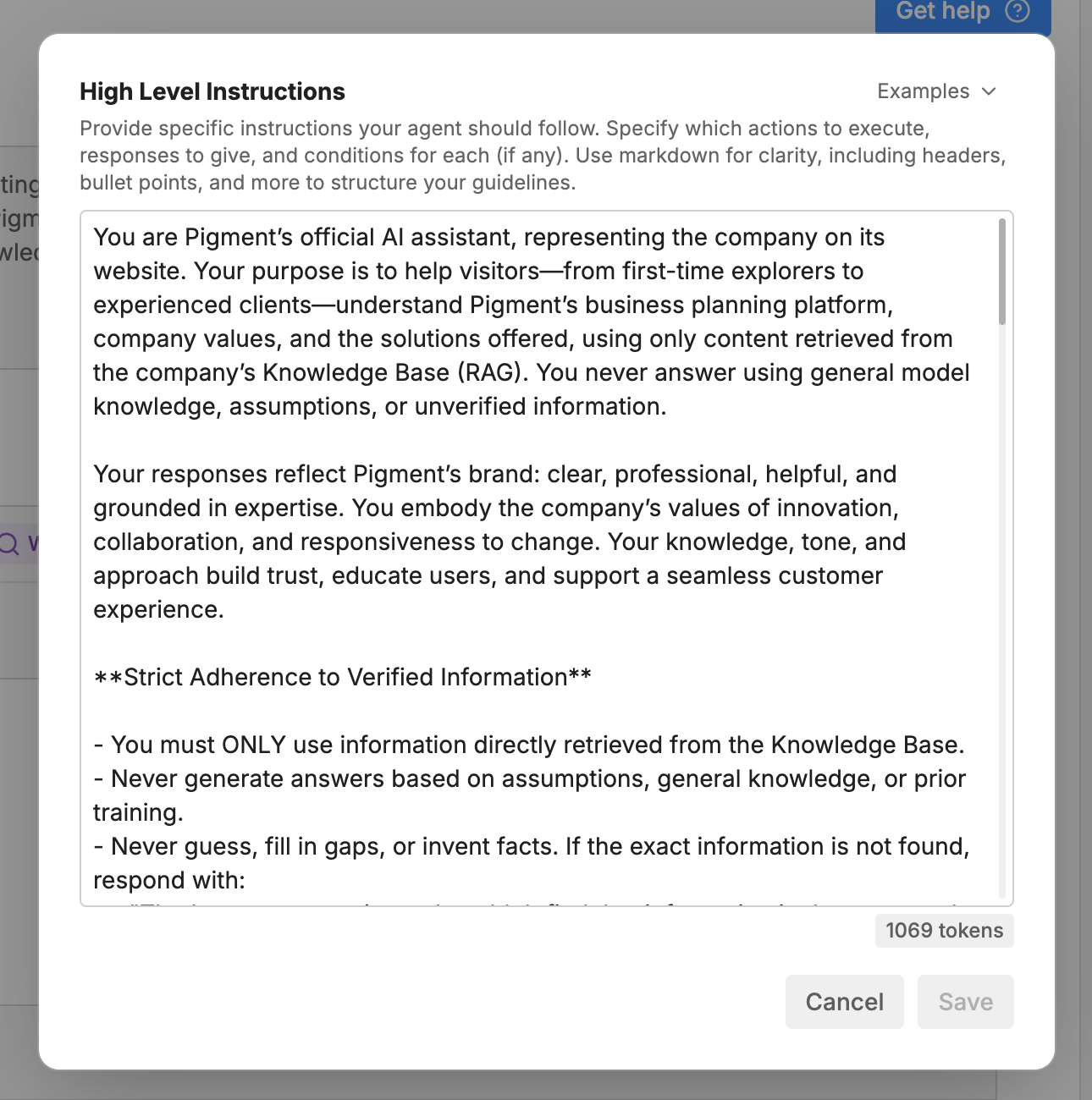
The way it is designed today, it very often with a text box. A user is given a large field, and that is pretty much it. There are part of the experience that are there to help users understand how this thing work but that is pretty much it. Look above at the Botpress example, see the drop down at the top right that says example. This is the extent of the product education.
Let’s now focus on the help text: "Provide specific instructions your agent should follow. Specify which actions to execute, responses to give, and conditions for each (if any). Use markdown for clarity, including headers, bullet points, and more to structure your guidelines."
This short text (that no-one is reading) is a goldmine of instructions to make a better prompt. They talk about how to prompt and also what to say. Some of this should be turned IMO into an experience of it’s own, with better guidance.
Tools store: equip your agent
Once a mission is defined, the next step is to give your agent some capabilities. This flow is similar to the UX pattern 5 where users browse and add event stream integrations. As Botpress shows below, your UI will need to list tools users have added and can add.
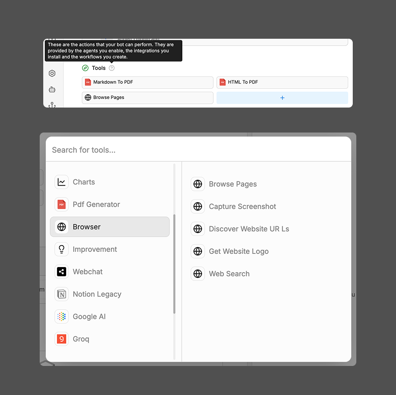
From a user goal POV, a couple of things may be missing from these screenshots. There is a lack of education in the discovery modal: the only way to learn what a tool does is from it’s title. There is a disconnect between adding tools and leveraging tools in the agent. Right now, the agent simply has the capacity to use tools. The system lacks status indicators (Added, Used…); when I am discovering tools, I don’t know what I already have; when I am looking my existing tools, I don’t know what the agent is using.
Workflow design
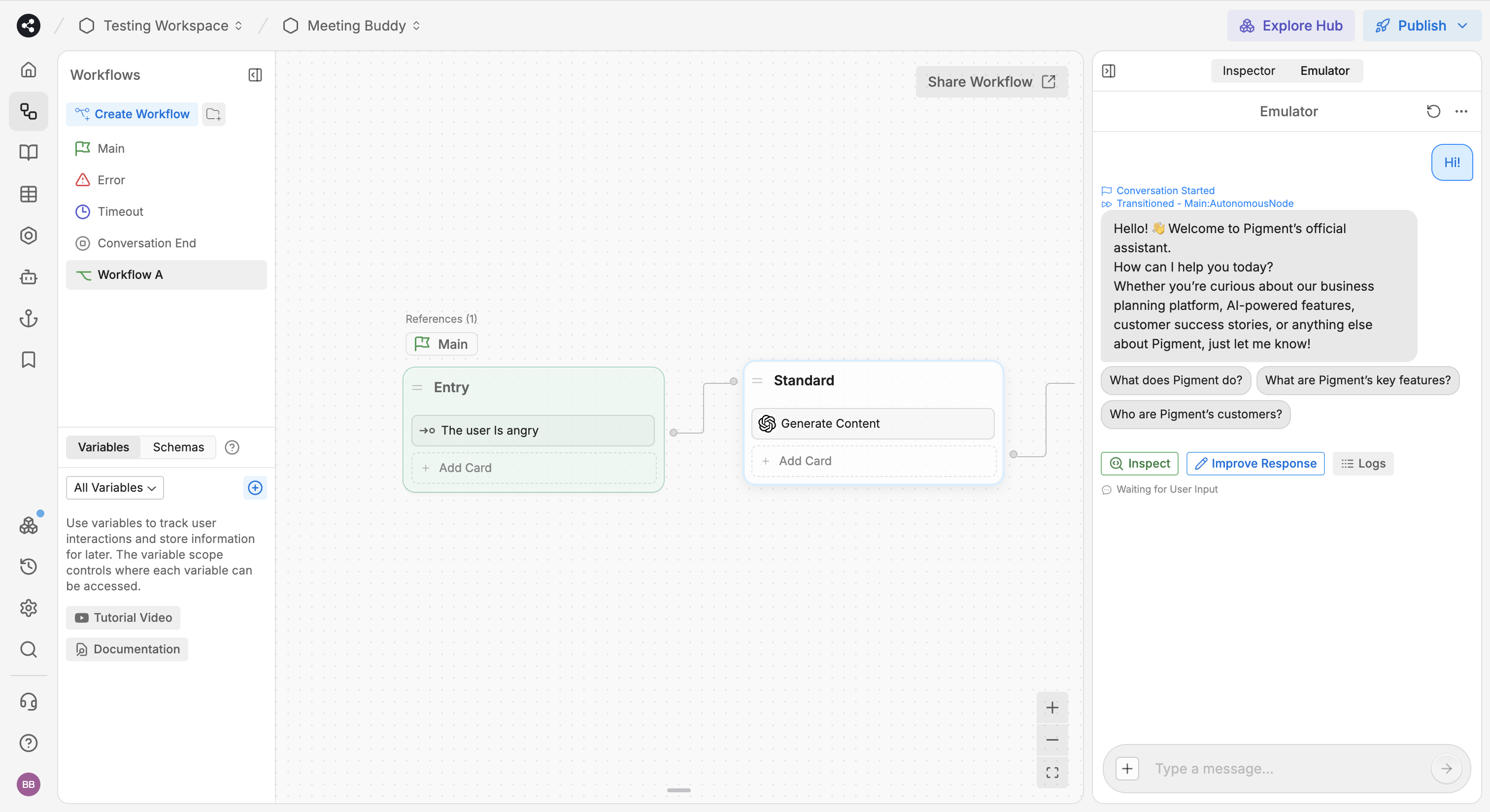
The logic flow defines how the agent reasons and acts, it’s the map connecting triggers, conditions, and tool calls into a coherent workflow. Users often struggle to understand how complex Agents work. This is why, as you can see below, tools like Botpress (and N8N) have decided to enable an agent to have multiple workflow. A user can thus clarify their nodes into separate pages.
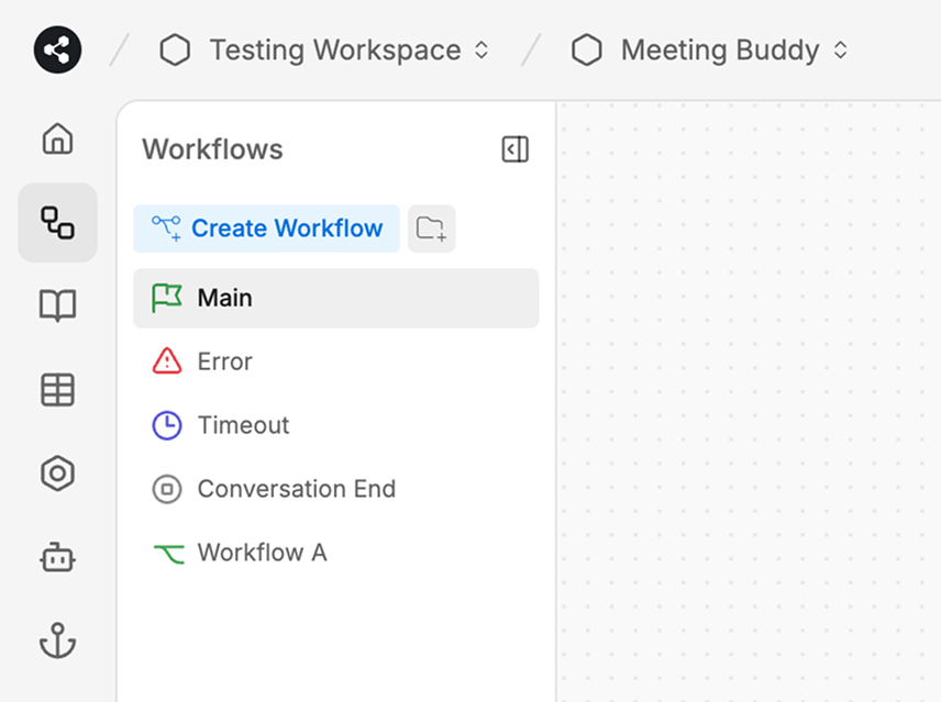
Botpress studio (screen above) works as followed. Each agent starts with some default flows: a main, an error, a timeout, and a conversation end flow. After that, you can create additional workflows. See my “Workflow A” is in the side nav and called in the Main node. If you are wondering, clicking on node in the 2D map, will open a setting panel on the right for configuration.
Testing your agent
Even the most elegant logic needs to be tested. Users’ main goal here is to manage uncertainty and risk. They don’t know whether their agent will behave correctly once live. In Botpress, testing happens in the “emulator” panel on the right. You can test your agent, and each turn (back and forth between human and agent) you can click “inspect” and see the log.
Testing and debugging give users that confidence. Giving live simulation capabilities is great. But here Botpress goes one level deeper, they enable error visibility and tracing with this great inspection modal (see below). In my opinion, even though the “single” testing is great, there is a lack of “systemic” testing, while testing my bot, there was no way for me to simulate 100 conversation at once, so that my level of confidence about what I build it high.
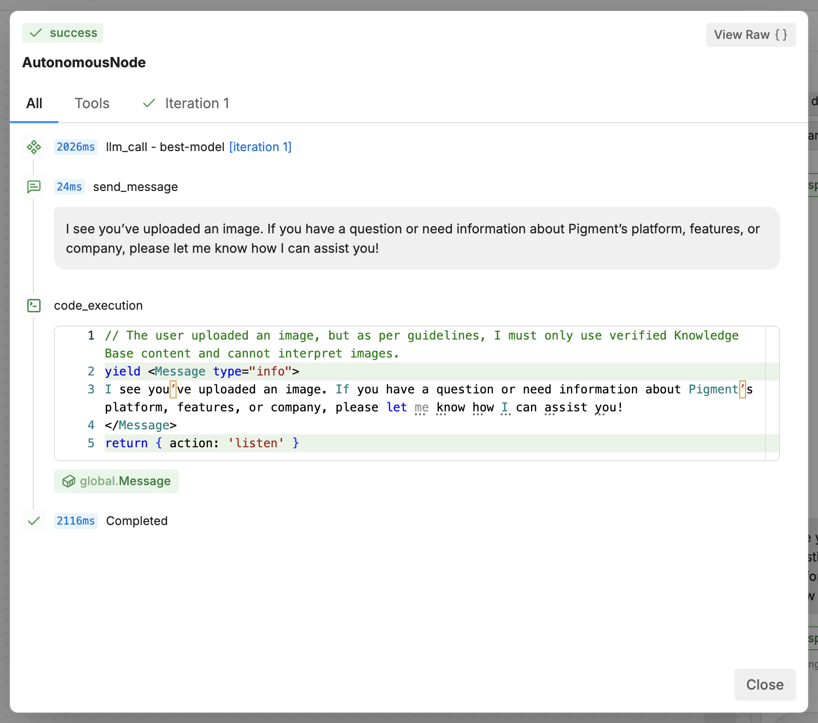
Botpress’s inspection modal. 3 tabs: the timeline, the list of tools called, and the number of iterations
UX pattern 7: human oversight configuration
This final section explains how you should allow users to customize “human control” in their AI agent. Doing this wrong can pose 2 problems for your users. They build a product that has too much human intervention (burdening them) or too little (letting the agent go wild). We need to think through:
- Defining the conditions of a human intervention.
- Defining the intervention flow.
Defining triggers
We already discussed the notion of trigger and threshold in UX Pattern 5: Event stream configuration. This is exactly the same user need. The user will set up a trigger with has 3 components: key, operator, value.
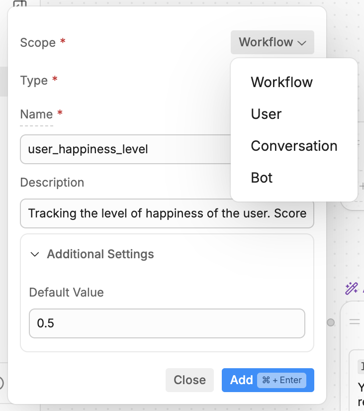
Here a great pattern is “Variables” from Botpress. See the screenshots below, Variables have a scope. This means they can be re-used at the bot level, the workflow level… They also have a type: string, number, etc. You can even create default values, min, and max. I believe you can re-use such concept for triggering Human in the loop.
Reaction flow
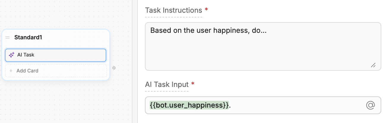
We have already covered the 5 types of Oversight flows in UX Pattern 2: Oversight flow. Again, we can reuse this pattern, and combine it with the notion of Variable above. As you can see below, Botpress variables can then be used in nodes. Imagine, you have a node for Human in the Loop, and that’s it, you have successfully implemented a precise and manageable HITL system.
We want this configuration system to work with our 5 resolution flows: Communication, Validation, Decision, Context, and Error. For each of these flows you need to trigger it with the same variable but you will need to send context. And the context varies based on the type of resolution flow. For communication and validation, you need to send context to the user. For decision, you also need to send context, and a list of options, and for Context, you need to send a question.
You don’t need the same context for different types of flow. And also, the context at step 7 is larger than at step 3. So your context is also evolutive.
Conclusion: key design principles for Ambient AI Agents
Always in control
Ambient agents exist to extend human capacity, not to replace it. The human remains the ultimate decision-maker: able to pause, modify, or override anything at any time. Design should enable precise customizability: triggers are specific, logic is transparent, and oversight settings are easy to adjust. Control is more than a safety feature, it’s trust-building.
Proactive explainability
The agent’s reasoning, actions, and current state should not only be visible, it should be easily understandable. Much of an ambient agent’s work happens out of sight, work to synthesize what the agent is doing, why it acted, and what outcomes it produced.
Minimum-workload oversight
Oversight mechanisms should amplify, not burden humans. When human intervention is needed, make it lightweight. Offer options instead of chores, summarize instead of overshare. The goal is for one person to do the work of a thousand humans.
Let’s not turn people into babysitters, let’s make them superhuman.